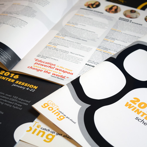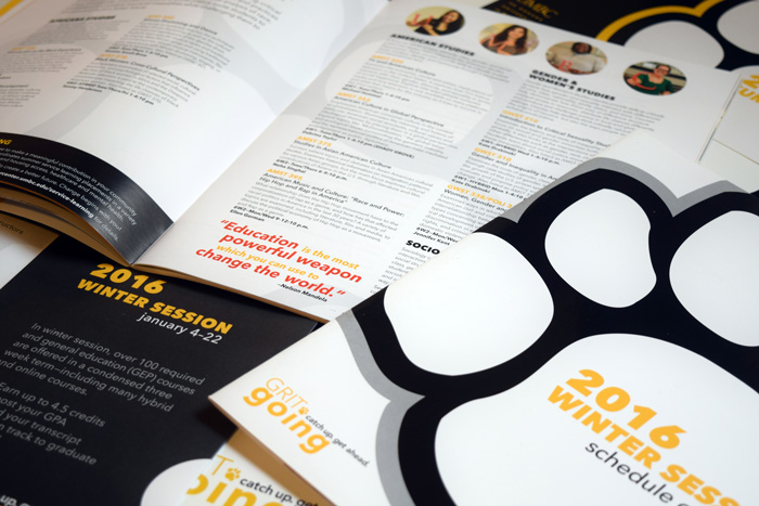
The UMBC Division of Professional Studies advertises yearly through a catalog design for summer and winter graduate and undergraduate courses. The summer session catalog is the largest, with the most course offerings, totaling 52 pages (inluding cover). Both 2016 catalogs were printed with a spot raised UV around the official university paw. The Grit Going wordmark, which I created in 2014, was featured throughout the design campaign, which included brochures, posters, and postcards and continues to be essential to ongoing campaign designs.
We could not be happier with the work Layla has done with the 2016 Winter and Summer Session catalogs. Her designs are eye-catching and have been well received among the student body. Layla was very easy to work with, open to critiques, and extremely quick with communication throughout the entire process, from the initial concept, to page layout and design, to the final product.
– Bobby Lubaszewski –
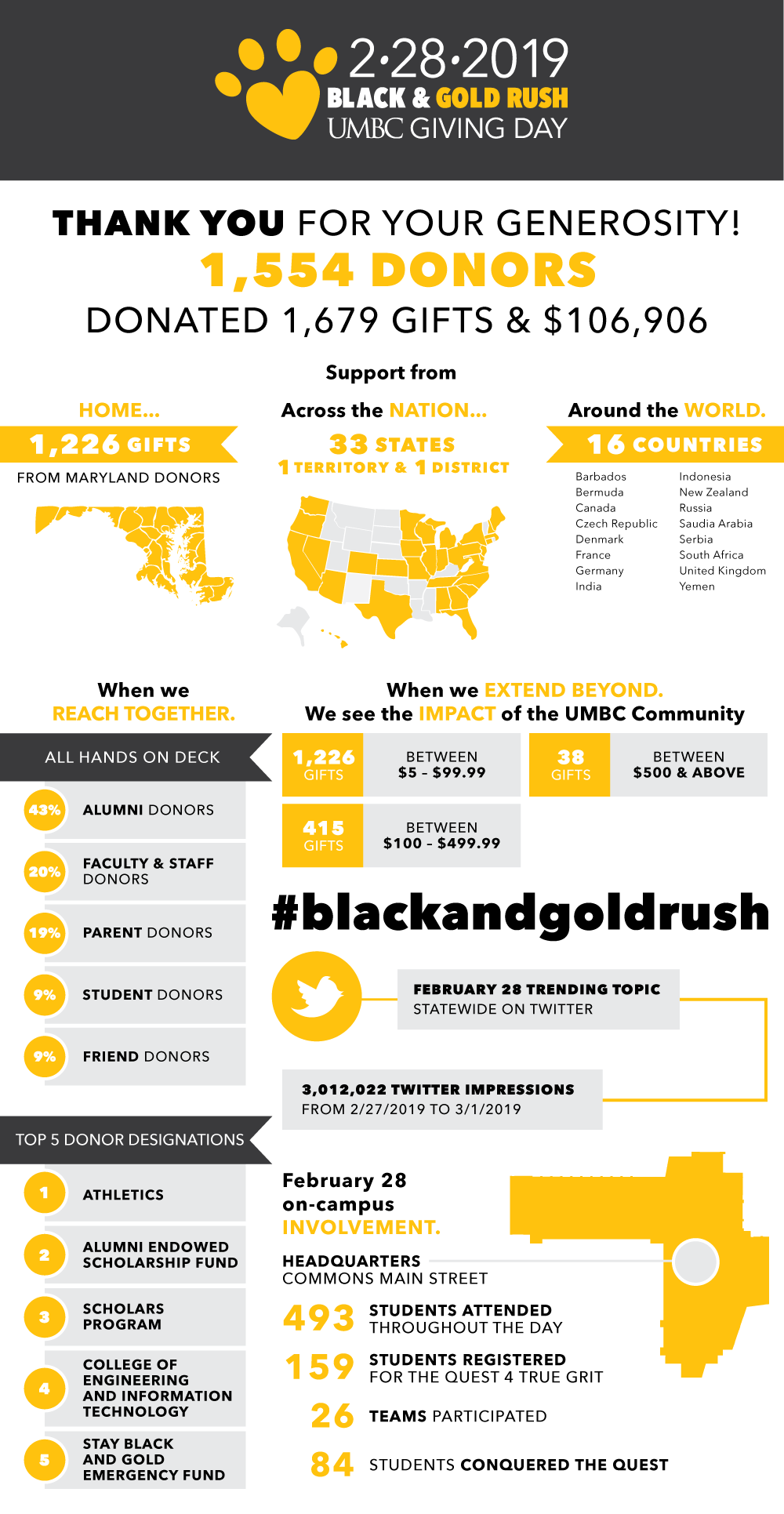
UMBC hosted it's first giving day on February 28, 2018 and has continued the tradition of hosting our annual giving day the last Thursday of the month of February. During this campaign to not only raise money, but to also increase donor engagement, multiple assets across print and digital media were created including infographics, social media graphics, Snapchat filters, flyers, posters, stickers, banners, billboards, and more. Follow the progress of our giving day every February at givingday.umbc.edu and on Facebook and Instagram.
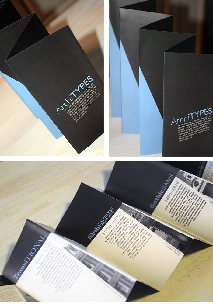
Architecture and typography have often exhibited similar shared forms and structure. Many popular typefaces were developed during architectural eras and mimicked their historical period counterpart. The similarities between a typeface design and its corresponding architectural era are highlighted in this informational brochure, which features a tiered "skyscraper-like," three-dimensional design of its own.
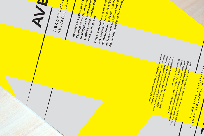
Averplate is a typeface designed through a combination of Avenir Next and Copperplate Gothic. While the term gothic usually refers to a sans-serf, small glyphic serifs are exhibited within this reimagined Copperplate Gothic typeface. The combination of Avenir Next and Copperplate Gothic creates a unique typeface that appears as a sans-serif from a distance, but a serif when viewed up close.
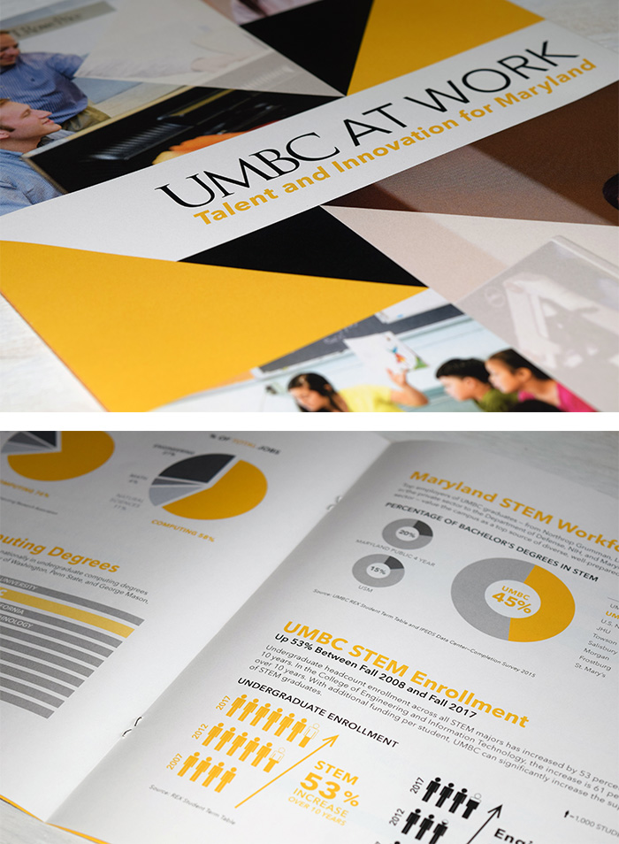
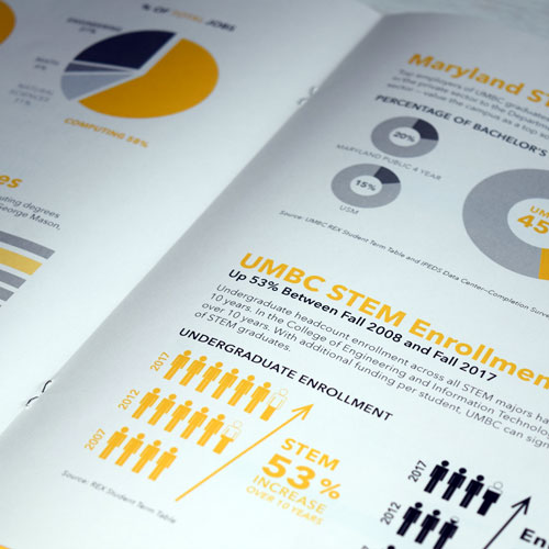
The Legislative Testimony occurs every 3 years in Annapolis, Maryland in order to secure support for a base funding increase for UMBC from the state. These infographics were created and used by the president of UMBC, Dr. Freeman Hrabowski, during his presentation in Annapolis to advocate for the additional funding. In addition to the printed materials used for the testimony, these graphics continue to be used across campus for digital presentations and on the web.
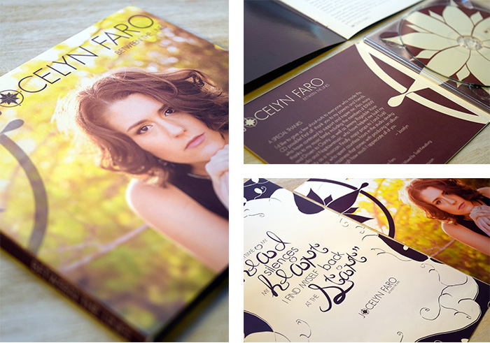
Jocelyn Faro is an Annapolis local singer and songwriter who's debut album appeared on iTunes in 2014. Jocelyn provided some great photography, and from there I developed her brand, which included a compass element, throughout her promotional materials, including digital album art, a CD DigiPak, posters, and more.
Layla was a pleasure to work with! We gave Layla a very tight deadline for creation of a logo and CD cover design (which was featured on iTunes & Amazon). Within 24 hours, Layla created something beautiful. Layla continued work on designing the entire cd packaging, press kits, and promotional posters. Her logo design is now used on all promotional products and the singer's website and other social media sites. Throughout the process, Layla exhibited professionalism and creativity. I highly recommend Layla and look forward to working with her again.
– Kelly Faro-Harvey –
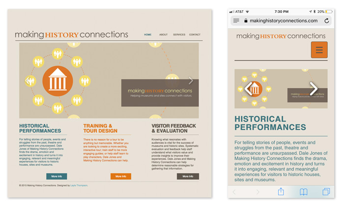
Making History Connections is a local business that helps museums and historic sites offer engaging programs and experiences for visitors through historical performances, staff training, and much more. The founder and owner needed a design refresh as well as the ability to update the site himself. After sharing a few options with him available in WordPress, SquareSpace, and Wix, the Wix template was selected and implemented. I transferred all the content from the client's previous site and placed it into the chosen template, and incorporated some additional design changes.
I recently had the pleasure of having Layla redesign my website. She completed work promptly and creatively and was a pleasure to work with. I would definitely work with her again and highly recommend her to others.
– Dale Jones –
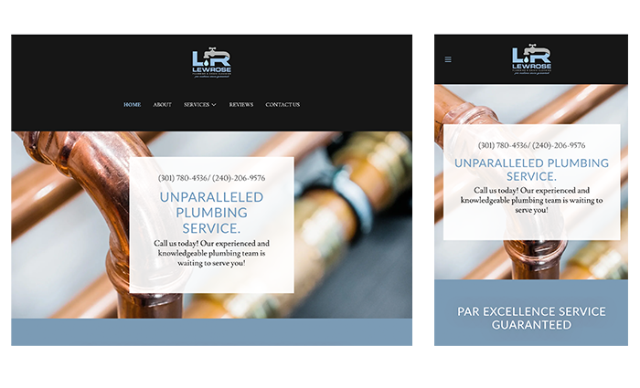
Lewrose Plumbing is a local, Maryland based plumbing company that offers unparalleled plumbing services. Their 3 marketing pillars are Reliable Professionals, Individualized Plumbing Options, and a Customer Service Guarantee. In order to call attention to these values, I created icons for these important marketing aspects in addition to building their site out using GoDaddy Central.
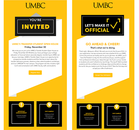
This recruitment email was designed for interested incoming freshman who did not official commit to UMBC as they're school choice. These emails consisted of event promotion for our open house, as well as a reminder to students to choose UMBC.
Every year, the president of UMBC sends a message to all staff thanking them for their devotion and giving kind words of encouragement. This year, the Grit & Greatness (Fundraising) Campaign was highlighted as it was the truest representation of the strength of the UMBC community. The cards displayed in the video were handwritten by students, faculty, and staff. The categories of questions fall into the three campaign goals: Make Big Breakthroughs, Forge True Partnerships, and Transform Lives.
The Crash is a short film that was filmed in one shot, for one minute.
This short animation was created for posting to the UMBC social media accounts and achieved 1,334 views.
Every year, UMBC hosts a Professional Development Day training for all staff and faculty. This year, selected staff and faculty were coached by TedX Speaker Coach, Jan Fox for months before they presented their very own TedX style talk, which UMBC has name Retriever Talks. This video was to promote attendance for both the morning and afternoon sessions.
For over two weeks, I carried a camera and shot parts of my life as instructed by the requirements of the project. From those life observations, I created this piece where a TV is used as a metaphor for life and death, and everything in between is just jumbled.
